Yoga Website Advice
5 Reasons Your Yoga Website May Be Losing Bookings
Most yoga businesses do not lose students because the teaching is poor. More often, the website quietly creates hesitation before trust has fully formed.
Someone discovers your website through Instagram, Google or a recommendation.
They arrive curious. Interested. Potentially ready to book.
But within seconds, something feels unclear.
The experience feels slightly overwhelming. The structure feels confusing. The atmosphere does not fully match the quality of the teaching.
Quietly, they leave.
Most yoga website problems are subtle. Visitors rarely explain why they did not book.
But over time, small moments of friction quietly reduce trust, enquiries and conversions.
Here are five of the most common reasons yoga websites lose bookings without realising it.
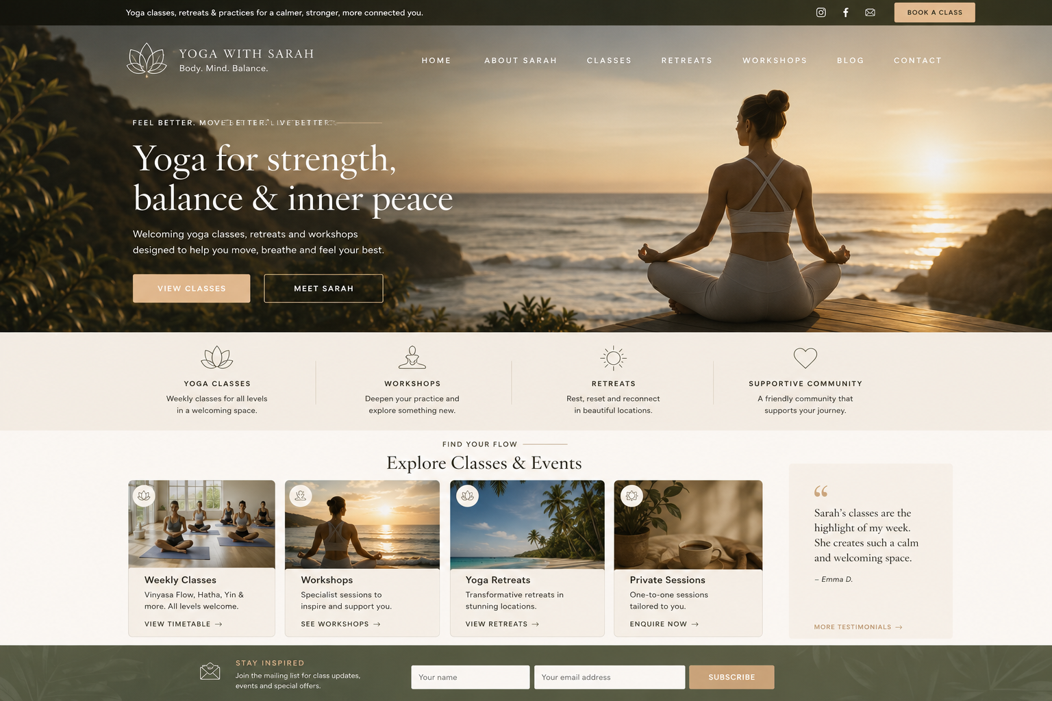
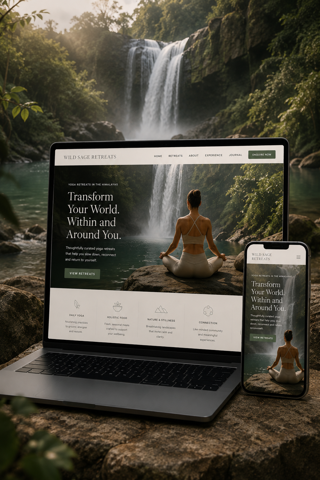
Your website no longer reflects the quality of the real experience
Many yoga teachers and studios create thoughtful, calming and genuinely transformational experiences in person — but their website still feels dated, cluttered or visually disconnected from that atmosphere.
Visitors form emotional impressions incredibly quickly.
Before reading deeply, they are already deciding whether the business feels trustworthy, professional and emotionally aligned with what they are seeking.
If the typography feels cramped, the imagery feels generic or the structure feels outdated, people often assume the experience itself may feel less established.
A strong yoga website does not need to feel corporate or aggressive.
Usually the opposite works better:
- More spacious layouts
- Better visual rhythm
- Calmer typography
- Stronger imagery
- Clearer structure
Visitors cannot quickly understand what you offer
Yoga businesses often grow organically over time.
Retreats are added. Workshops appear. Online memberships launch. Private sessions evolve.
Eventually the website becomes a collection of disconnected pages instead of a clear visitor journey.
New visitors should never need to search for basic answers:
- What classes do you offer?
- Who are they for?
- Where do they happen?
- How do I book?
Clarity reduces cognitive effort.
When the next step feels obvious, booking starts to feel natural rather than mentally tiring.
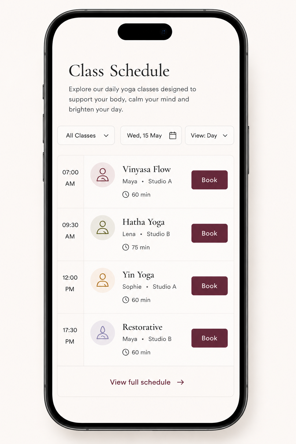
The mobile experience feels stressful instead of calming
Most yoga website visitors now arrive through mobile:
- Google Maps
- Local search
- Shared links from friends
Yet many yoga websites are still designed primarily for desktop screens.
On mobile, the experience often becomes cramped and emotionally heavy:
- Too much text pushed together
- Buttons difficult to tap
- Class schedules hard to scan
- Awkward image scaling
- Overcrowded sections
Even if visitors cannot explain exactly what feels wrong, they still feel the friction emotionally.
Calm websites create a completely different response:
Ease. Trust. Spaciousness. Confidence.
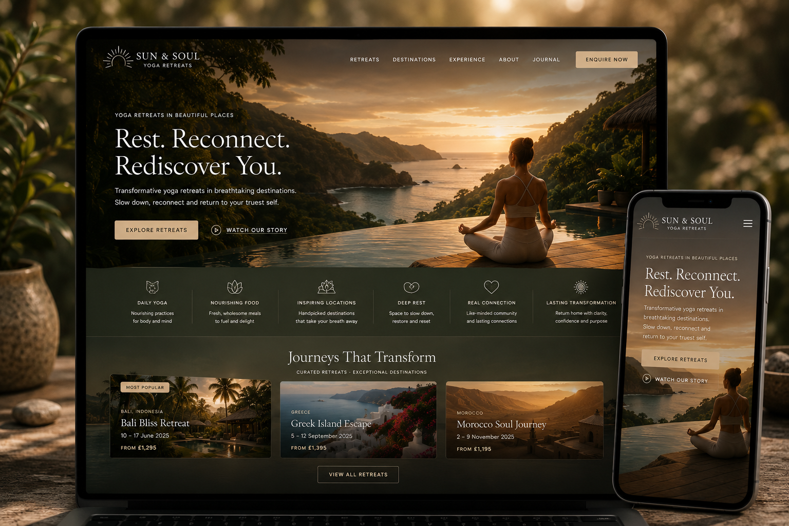
Your website communicates information, but not feeling
Most yoga businesses are not chosen through logic alone.
Visitors are not simply comparing timetables and prices.
They are imagining:
- Will this feel welcoming?
- Will I feel comfortable here?
- Can I trust this teacher?
- Will this experience feel calming or transformational?
Many websites communicate practical information while completely missing the emotional layer.
Strong imagery, slower pacing, intentional typography and emotionally aligned copy all help create trust before a booking button even appears.
Your website asks people to book before enough trust has been built
Many websites push for action too quickly.
“Book now” appears everywhere before visitors fully understand the teaching, atmosphere or experience itself.
But trust is usually built more quietly.
- Thoughtful imagery
- Calm page structure
- Teacher credibility
- Clear explanations
- Emotional reassurance
- Simple navigation
Once visitors feel emotionally safe and clear, taking the next step becomes far easier.
Final thought
The best yoga websites feel calm before they sell
Most yoga websites do not need louder marketing.
They usually need more clarity, stronger emotional alignment and a calmer user experience that better reflects the real quality of the work behind the business.
If you would like honest feedback on your current yoga website, you are welcome to get in touch.
I can usually identify a few simple improvements that would immediately make the experience feel clearer, calmer and easier to trust.
Yoga Web Designer Liam O’Neill works with both aspiring teachers and studios, as well as more experienced practitioners determined to elevate themselves to their full potential.