
5 Reasons Your Yoga Website May Be Losing Bookings
Your teaching might be excellent. But if your website makes classes difficult to understand, trust or book, potential students may leave before you ever hear from them.
Why might a yoga website receive visitors but few bookings?
A yoga website may lose potential bookings when its design does not reflect the teaching experience, visitors cannot find essential class details, mobile navigation is difficult, the atmosphere feels impersonal or the booking process asks for commitment before people feel informed. The best starting point is to test the complete journey from discovery to confirmation.
Imagine someone discovering your classes through Instagram, a Google search or a recommendation from a friend. They are curious, perhaps even ready to try yoga for the first time. They open your website to see whether your classes are right for them.
Social media can introduce your teaching, but it cannot always answer the questions that lead to a booking. For a closer look at this relationship, read why Instagram alone is not enough for a yoga business.
Within moments, something becomes uncertain. The schedule is difficult to find. The mobile page feels crowded. The teacher’s approach is not explained. Or the booking button sends them somewhere unexpected, with no clear information about what happens next.
They may simply leave. You rarely hear from people who decide not to enquire, so these moments are easy to overlook. Not every lost visit represents a lost booking, but avoidable confusion can make it harder for interested visitors to take the next step.
This guide explains five common problems, how to recognise them, and what to improve first. It also includes a practical self-audit and answers to common questions about yoga website bookings.
Your website no longer reflects the quality of the real experience
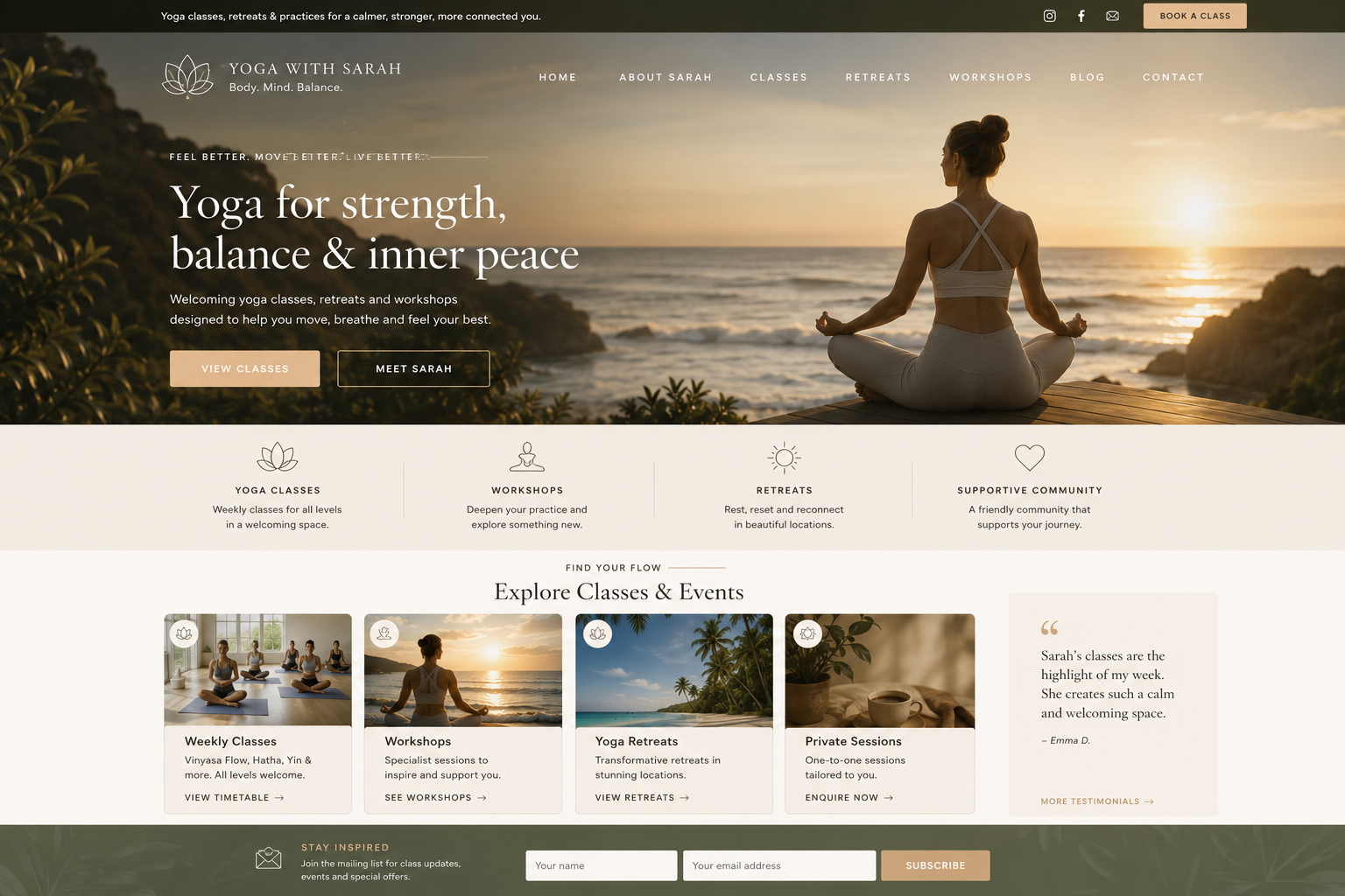
Many yoga teachers create thoughtful, welcoming and deeply personal experiences in person, while their websites still feel dated, cluttered or disconnected from that atmosphere. The gap is not necessarily a lack of investment. Often the site has simply grown through small additions without a clear visual direction.
Visitors make early impressions from imagery, spacing, readability and organisation. Those impressions are not a reliable measure of teaching quality, but they can influence whether someone feels confident exploring further.
A strong yoga website does not need aggressive sales techniques or expensive visual effects. It needs a consistent identity and a presentation that feels appropriate to the people you want to welcome.
- Use authentic, high-quality photographs of the teacher, studio or retreat where possible.
- Give headings and paragraphs enough space to breathe.
- Keep typography and colours consistent across pages.
- Make the main service or class offering obvious without scrolling endlessly.
- Remove old promotions, broken links and outdated class information.
Practical test: Show your homepage to someone who has never attended your classes. Ask them to describe the atmosphere they expect. Does their impression match the experience you actually provide?
Visitors cannot quickly understand what you offer
Yoga businesses often grow organically. A teacher begins with weekly classes, then introduces workshops, private sessions, retreats or an online membership. Without careful organisation, the website becomes a collection of pages rather than a clear route for a new visitor.
Your navigation should reflect how students make decisions, not just how your business is organised internally. Someone searching for a beginner class needs different information from someone considering a residential retreat.
For each important offer, explain who it is for, what happens, where or how it takes place, what it costs or how pricing works, and how to take the next step. Avoid requiring a visitor to piece together those details from several pages.
- What type of yoga is offered, and is it suitable for beginners?
- Where and when do classes take place?
- What should a student bring or expect?
- How much does it cost, and what is included?
- How can someone book, enquire or ask a question?
Before and after: “Explore my offerings” leaves visitors to investigate. “View beginner classes in Sale, with times, prices and booking” gives a clearer next step. This is an illustrative copy example, not a measured client result.
The mobile experience feels stressful instead of calming
A potential student might open your website from an Instagram profile, a shared message, Google Maps or a local search. Mobile usability therefore deserves the same attention as desktop design.
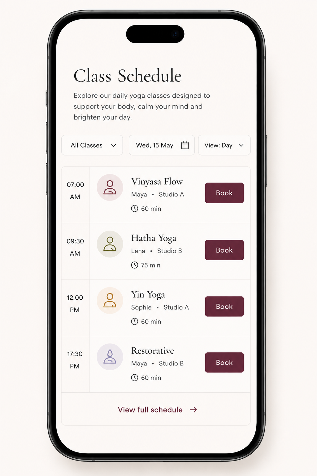
A page can look beautiful on a large monitor while becoming frustrating on a phone. Timetables may shrink, buttons may be difficult to tap, navigation may overlap headings and forms may ask for too much typing.
Test the actual booking journey on a real phone. Do not stop at checking whether the homepage looks attractive. Follow the class link, choose a date, complete the form and confirm that the booking or enquiry is received.
Performance matters too. Oversized images, unnecessary animation and heavy plugins can slow the experience. Optimise images and review page performance without sacrificing the useful detail students need.
- Text remains readable without pinching or zooming.
- Buttons and links are easy to tap.
- Schedules and prices do not require horizontal scrolling.
- The header does not cover the first lines of content.
- The booking journey works from start to finish.
Practical test: Ask a friend to find and book a beginner class on their phone without instructions. Watch where they hesitate, rather than explaining the page to them.
Your website communicates information, but not feeling
Yoga students are not only comparing times and prices. They may also be wondering whether they will feel welcome, whether the teaching style suits them and whether they will feel comfortable arriving for the first time.
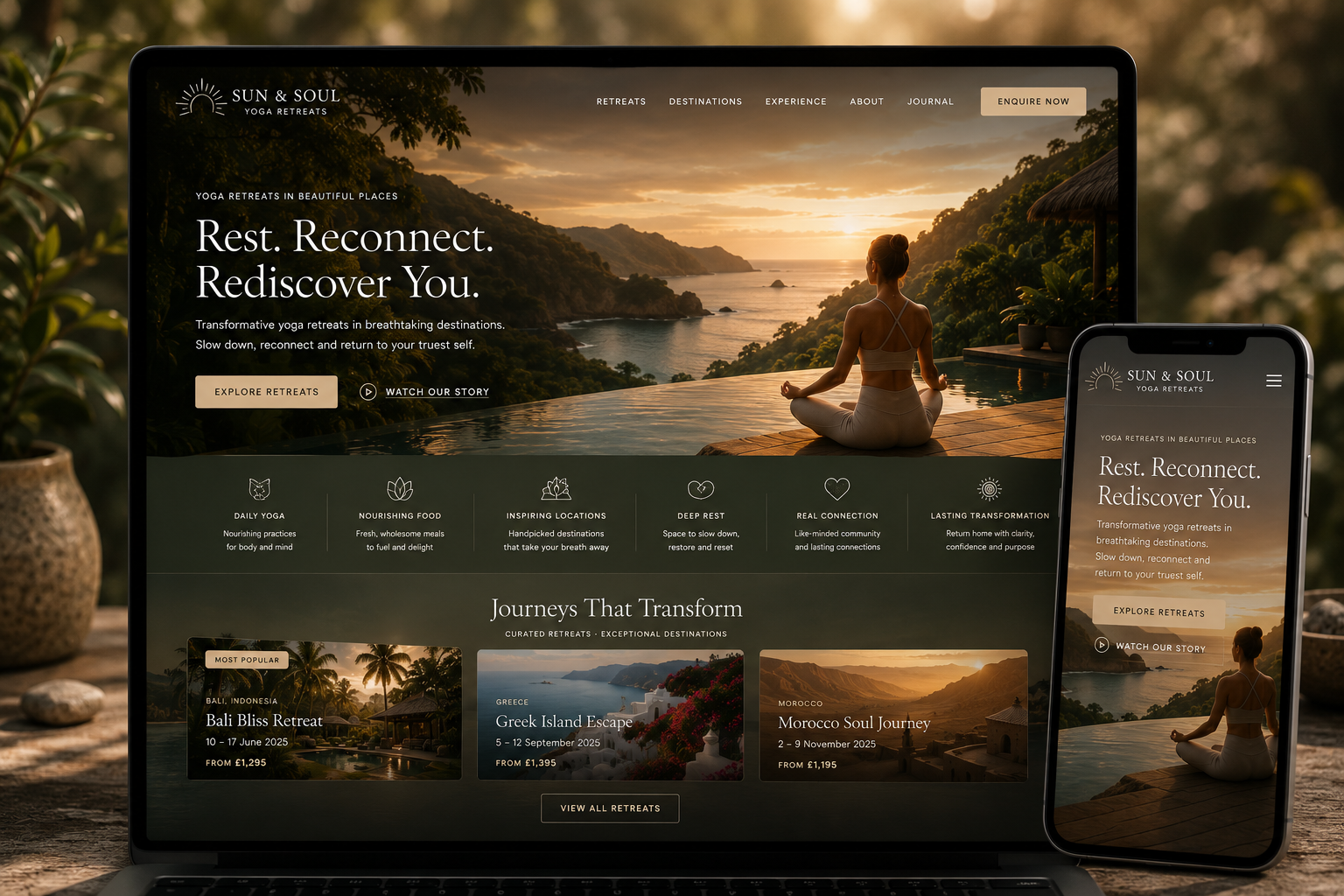
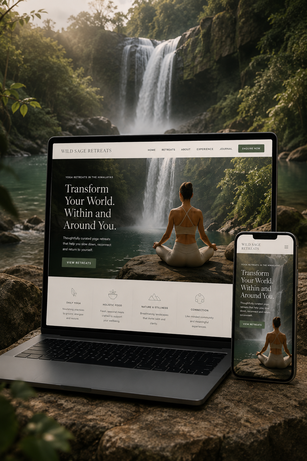
A website cannot replace the experience of meeting a teacher. It can, however, give people a more realistic sense of the atmosphere through genuine photography, clear explanations, welcoming language and practical reassurance.
This is especially important for retreats, private yoga and higher-value programmes. Visitors may need to understand the setting, group size, daily rhythm, accommodation, accessibility and what is included before they feel ready to enquire.
Avoid vague promises of transformation. Specific descriptions of what participants can expect are usually more useful than dramatic claims.
- Introduce the teacher in a natural, specific voice.
- Show the real space or setting where possible.
- Explain what a first visit or retreat day involves.
- Include authentic testimonials with permission.
- Address common concerns about experience level and accessibility.
Example: “All levels welcome” is helpful, but “New students are welcome; you can take breaks and adapt postures throughout the class” gives a more concrete picture of the experience.
Your website asks people to book before enough trust has been built
A booking button should be easy to find, but a button alone does not create confidence. Some visitors are ready to act immediately; others need to understand the offer first. Good page design supports both.
The problem is not having too many calls to action in every circumstance. It is asking for commitment without giving people enough information to make an informed decision.
For a weekly class, a visible schedule, price and simple booking link may be enough. For a multi-day retreat, visitors may reasonably want an itinerary, accommodation details, cancellation terms, teacher information and a chance to ask questions.
Place relevant reassurance close to the decision point. That could be a short teacher introduction, an explanation of what happens after booking, a clearly stated refund policy or a contact option for uncertain first-time students.
- Match the call to action to the commitment being requested.
- Explain the next step before sending visitors to another platform.
- Show key practical details before payment or enquiry.
- Make contact options available without forcing a conversation.
- Check that confirmation messages and follow-up instructions work.
Useful distinction: “Book a class” may be appropriate for a £12 drop-in session. “Explore the retreat and ask a question” may be more suitable for a higher-value experience. These are examples, not universal conversion rules.
Discover → Understand → Trust → Book
Four connected stages help explain where a promising website visit can become an enquiry or booking — and where it can stall.
An original practical framework used by Yoga Web Designer to explain the visitor journey; not a claim of measured conversion performance.
What does a better yoga booking journey look like?
Consider a hypothetical teacher offering beginner-friendly evening yoga classes. A prospective student searches for a class nearby and lands on the homepage. In the less effective version, they encounter a beautiful photograph but cannot find the location, class level or price. The booking button opens a separate platform without explanation.
In the improved version, the homepage identifies the teacher, location and class type immediately. A dedicated class page explains what beginners can expect, shows the next available dates, states the price and links to a mobile-friendly booking form. A confirmation message explains what to bring and where to go.
Nothing about this example guarantees more bookings. Its value is that each stage removes a specific uncertainty that can otherwise interrupt the visitor’s decision.
| Common friction | Clearer alternative |
|---|---|
| “Classes” hidden in a crowded menu | Prominent “View classes and timetable” link |
| Prices available only by DM | Visible prices or a clear pricing explanation |
| Generic stock photographs | Authentic teacher and studio imagery |
| Booking platform opens unexpectedly | Brief explanation of what happens after clicking |
| Unclear first-visit expectations | Short beginner FAQ and practical arrival guidance |
A 10-minute yoga website booking audit
Open your website on a phone and answer these questions as a first-time visitor would. Each “no” suggests something worth investigating, not proof that bookings are being lost.
Can someone tell what kind of yoga you offer and who it is for within a few seconds?
Are locations, times, suitability and prices easy to find?
Can you read, navigate and tap without zooming or horizontal scrolling?
Can visitors see who teaches and what the experience is like?
Does each important offer have an obvious, relevant next step?
Can you complete the full journey and receive confirmation?
Does each key service or location have useful, descriptive content?
Are headings logical, images described and links meaningful?
Are class details, contact information and policies current?
Can you distinguish website visits, enquiries and completed bookings?
How should you prioritise the fixes?
Start with problems that prevent someone from completing a booking at all: broken links, unreadable schedules, missing dates or a non-working form. Next, address clarity and mobile usability. Only then spend time refining decorative details.
Where possible, measure the journey before and after changes. Useful signals include clicks from the class page to the booking platform, completed enquiries, actual bookings and repeated questions from prospective students. A change in one metric is not automatically caused by a redesign; seasonal demand, promotions and traffic sources can also affect results.
For teachers looking to improve search visibility alongside the booking experience, Yoga SEO can help organise relevant class and location information. If the site needs a broader rethink, explore websites for yoga teachers, yoga studio websites or yoga retreat websites, depending on your business.
If you teach through memberships, video libraries or live-streamed sessions, the booking journey has different demands. Explore websites for online yoga classes for a more tailored approach to presenting digital offers and helping students understand how to join.
Can a clearer website help Google and AI assistants understand your business?
Yes, clear public information about services, locations, teachers and booking options can make a website easier for search systems to interpret. Search engines still need to discover and index the pages, and neither Google nor ChatGPT guarantees visibility or recommendations. Write for prospective students first, using descriptive headings, accurate details and accessible HTML.
Yoga website bookings: common questions
Why is my yoga website getting visitors but no bookings?
The issue may be the quality or intent of the traffic, unclear class information, a difficult mobile experience, missing reassurance, or a booking process that introduces friction. Review the journey from the landing page to the booking confirmation, rather than assuming the design alone is responsible.
What should be on a yoga teacher website homepage?
A useful homepage quickly identifies who you help, what you teach, where or how classes take place, and what visitors should do next. Include a short introduction to the teacher, relevant class or service links, genuine imagery, appropriate testimonials and a visible booking or enquiry route.
How can I make my yoga class booking process easier?
Keep the route short, make the schedule readable on mobile, explain prices and prerequisites before checkout, and avoid unnecessary forms. Test the complete process yourself on a phone, including confirmation messages and any external booking platform.
Does a slow yoga website affect bookings?
A slow page can frustrate visitors, particularly on mobile connections. Compress images appropriately, avoid unnecessary scripts and check real-world performance. Speed is one part of the experience; clear information and a working booking flow matter too.
Should yoga class prices be visible on my website?
Usually, transparent pricing helps people decide whether a class is suitable. If prices vary, explain the starting price, what is included or how to request a quote. Retreats and private programmes may need a more detailed explanation before someone enquires.
Can redesigning my yoga website increase bookings?
A redesign can remove barriers and improve clarity, but it cannot guarantee more bookings. Results also depend on traffic quality, local demand, the offer, pricing and competition. Establish baseline enquiries and bookings before making changes so improvements can be assessed.
How do I know which website pages are losing potential students?
Use privacy-conscious analytics and booking-platform reports to compare visits, clicks and completed bookings. Look for pages with relevant traffic but weak next-step engagement, then review them manually on mobile. Avoid drawing conclusions from tiny sample sizes.
Can Google or ChatGPT recommend my yoga business?
Potentially. Publicly accessible, accurate pages about your classes, location, teacher credentials and booking options can help search systems understand your business. There is no guaranteed ranking or AI recommendation, and the content should primarily serve prospective students.
The best yoga websites make booking feel natural
Your website does not need louder marketing. It needs to reflect your teaching, explain your offers clearly and make it easier for the right students to decide whether to take the next step.
If you would like thoughtful feedback on your current yoga website, I can review the visitor experience and discuss which improvements are most worthwhile.
Further reading and useful references
- Google Search Central: Creating helpful, reliable, people-first content
- web.dev: Learn accessibility
- Google Search Central: Understanding page experience
- OpenAI: Web crawlers and user agents
These references support general technical and content principles. They do not establish that any particular design change will increase bookings. For more practical guidance, browse the Yoga Web Designer Insights articles.
Yoga Web Designer Liam O’Neill works with both aspiring teachers and studios, as well as more experienced practitioners determined to elevate themselves to their full potential.